YANDIAN | 盐典
AD.D. HSIAOCHENGLU
MD. SANGLIN
YEAR 2023
CL YANDIAN
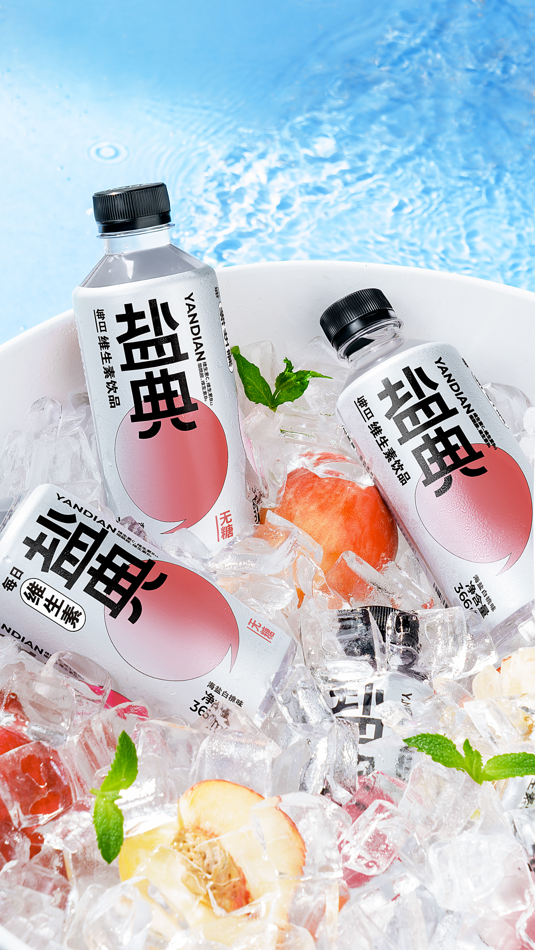
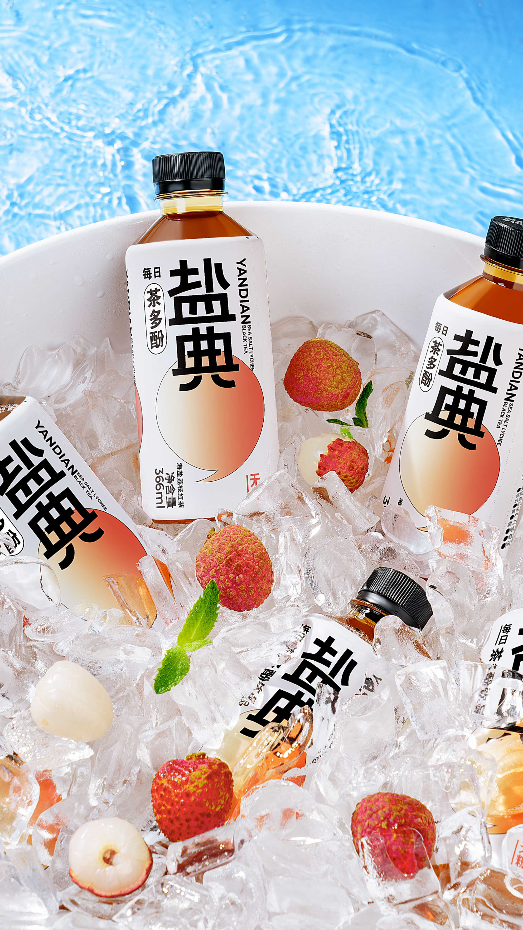
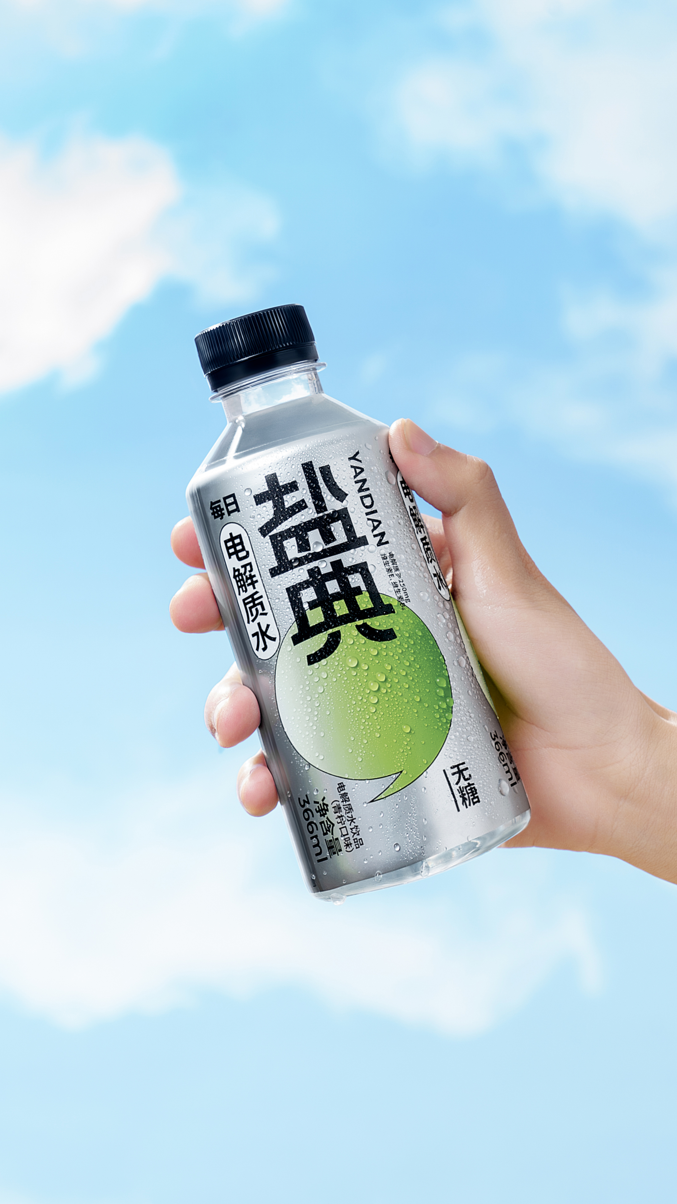
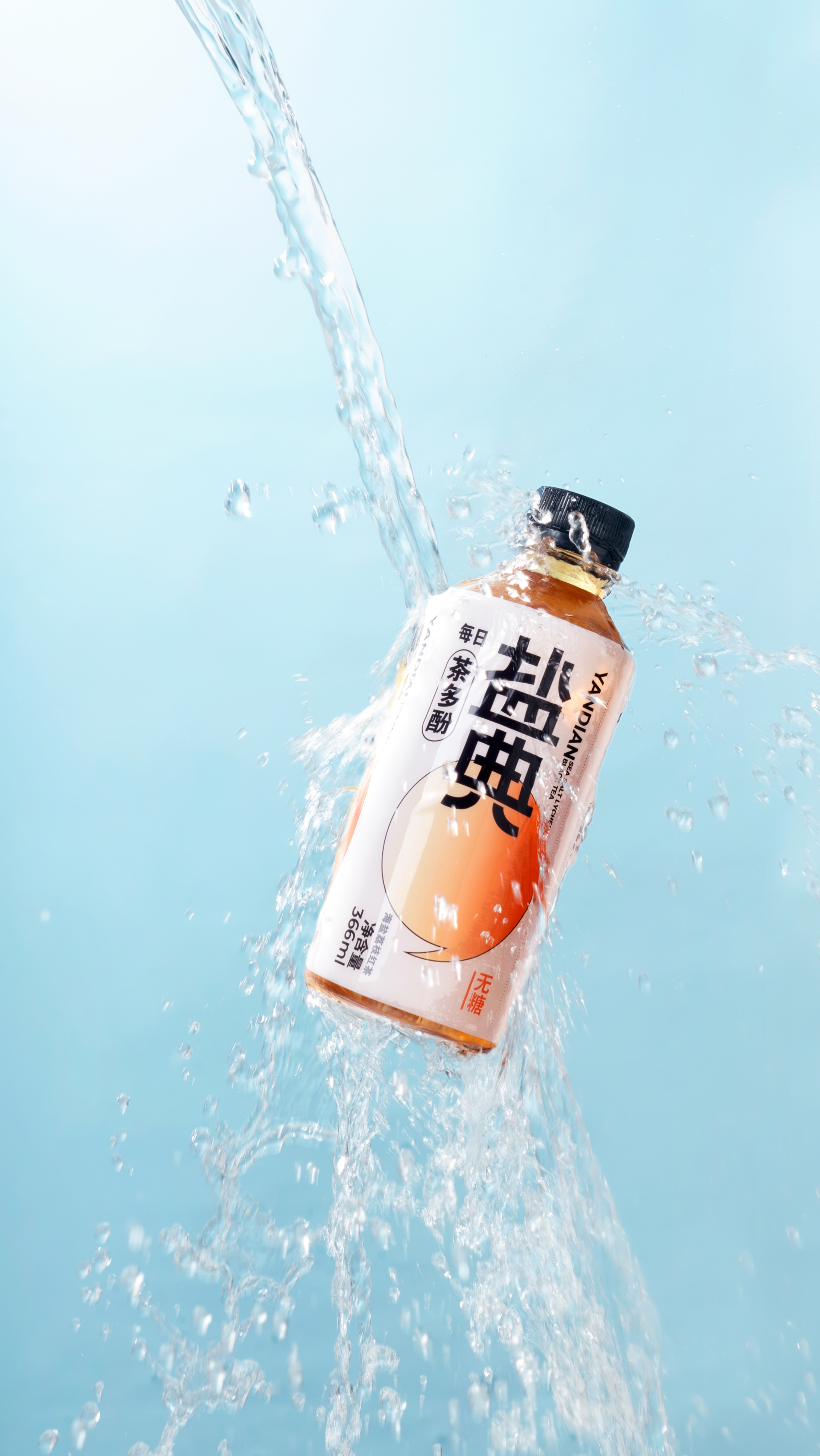
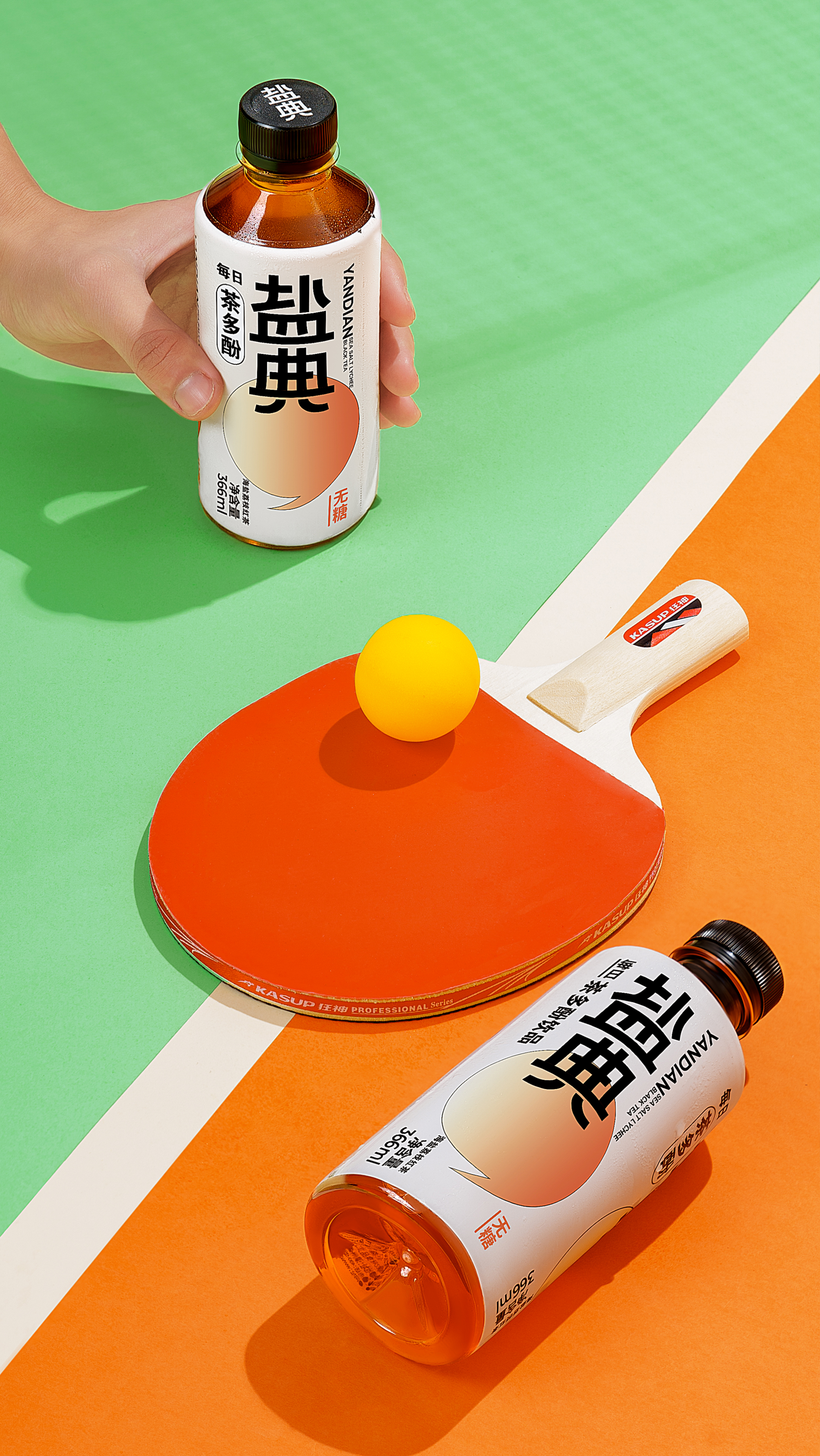
盐典在筹备新系列“每日电解质水”时,委托铮设计®打造一款更具现代感的包装,以适配更富年轻活力的产品定位。饮品包装对视觉的第一要义是:能在货架上被一眼认出。所以我们希望用一个强有力的符号去统一整个系列。
运动时补充电解质,能让身体迅速恢复活力。我们由此联想到用“逗号”来表达“可持续性”,并重新设计了“盐典”两个字,搭配银白底色,延续消费者对运动饮料的基础印象。
我们用不同颜色的逗号来区分不同口味,从配色、线条到字形,整体视觉始终保持简单直接。单一强烈的画面和跳跃的色彩,让饮品在冰柜里更加醒目。
YANDIAN commissioned Chengdesign® to create a more modern packaging for their new "Electrolyte Water" series, targeting a younger and more energetic audience.The primary visual priority for beverage packaging is to be instantly recognizable on the shelf. Therefore, we aimed to unify the entire series with a strong symbol.
Drawing inspiration from the benefits of electrolyte replenishment during exercise, we used a "comma" symbol to represent "sustainability" and redesigned the "YANDIAN" logo. With a silver-white background color, the packaging maintains the consumers' basic impression with sports drinks.
Distinctive colored commas differentiate the flavors, while the overall visual design remains simple and direct, from color schemes to typography. The bold and vibrant visuals make the beverages highly noticeable in the freezer.
AD.D. HSIAOCHENGLU
MD. SANGLIN
YEAR 2023
CL YANDIAN
盐典在筹备新系列“每日电解质水”时,委托铮设计®打造一款更具现代感的包装,以适配更富年轻活力的产品定位。饮品包装对视觉的第一要义是:能在货架上被一眼认出。所以我们希望用一个强有力的符号去统一整个系列。
运动时补充电解质,能让身体迅速恢复活力。我们由此联想到用“逗号”来表达“可持续性”,并重新设计了“盐典”两个字,搭配银白底色,延续消费者对运动饮料的基础印象。
我们用不同颜色的逗号来区分不同口味,从配色、线条到字形,整体视觉始终保持简单直接。单一强烈的画面和跳跃的色彩,让饮品在冰柜里更加醒目。
YANDIAN commissioned Chengdesign® to create a more modern packaging for their new "Electrolyte Water" series, targeting a younger and more energetic audience.The primary visual priority for beverage packaging is to be instantly recognizable on the shelf. Therefore, we aimed to unify the entire series with a strong symbol.
Drawing inspiration from the benefits of electrolyte replenishment during exercise, we used a "comma" symbol to represent "sustainability" and redesigned the "YANDIAN" logo. With a silver-white background color, the packaging maintains the consumers' basic impression with sports drinks.
Distinctive colored commas differentiate the flavors, while the overall visual design remains simple and direct, from color schemes to typography. The bold and vibrant visuals make the beverages highly noticeable in the freezer.